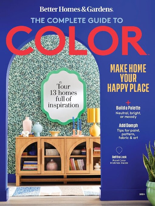
BH&G The Complete Guide to Color
Editors’ Letter
Masthead
Color Theory Opener • Selecting just-right complementary, contrasting, or monochromatic colors to achieve a desired look needn’t be a guessing game. It’s a science, after all.
First Steps
Wheel of Fortune • A jackpot of palette possibilities awaits within a paint deck. Consider these three winning schemes.
Anatomy of a Lightbulb • Getting the light right is the first step toward showing your true colors. But as lightbulb technology becomes more advanced, packaging can be baffling. Learn a few good-to-know terms before you hit the store.
The Neutral-Lover’s Guide to Color • Used the right way, almost any color can act as a neutral and still be as livable as a gray or beige backdrop. It’s all about execution. We quizzed color experts and interior designers to find out how.
Wood Working • Consider this a master class in adding color that works with your wood trim, floors, and furnishings—whether you want to play up the wood or tone it down.
Trimmed Out • An afterthought no more, millwork is showcased with color.
Just Right Whites (& Other Neutrals) Opener • What blank slate? From the deepest black on the paint chip to the breeziest white, neutrals have the power to quietly but completely shift the tone of a room.
White Out • White is known as a bright backdrop. But the right white can be much more, setting the mood for a room. Consider your lighting, your furnishings, and how you want to feel in the space.
True Colors • An art-lover’s sweet new bungalow could have ended up a jumble of serendipitous finds. Instead, a design-pro friend used color and the owner’s favorite things to turn the home into one original work of art.
Fulfilling Her Vision • A four-year remodeling project did more than produce a beautiful home. It also expanded the homeowner’s DIY skills and confidence—not to mention her tool collection.
A Fine Finish • A parade of textures and natural fibers makes this home’s neutral scheme anything but vanilla.
Set the Tone • A New York City apartment gets a jolt from the juxtaposition of bright jewel tones and barely-there hues.
On the Brights Side Opener • Here comes the sun! With the right amount of zing, punchy shades and cheerful patterns play harmoniously on walls and in textiles.
Light the Way • From sunny oranges and yellows to dazzling pinks and blues, jazzy colors can bring energy to a whole house or a single room. Designers share how to add pep through decor or paint.
Global Vision • A white backdrop lets travel-inspired hues of peacock blue, fiery red, and deep sea black pop in a Minneapolis designer’s home.
World Hues • Beaches near Bangkok. Glaciers in Iceland. The French Quarter in New Orleans. Vivid, earth-inspired shades fill this Los Angeles space, creating a warm respite whenever the homeowners return from their adventures.
Pattern Play • Cheer abounds in this South Carolina home, where personal touches and detailed textiles weave through every room.
A Little Moody Opener • Don’t be afraid of the dark. Deep shades can dial up the drama or calm down the feel of any room.
Bold & Beautiful • Deeply saturated hues, while often considered dark or cold, can invoke warmth and interest in your space. Designers reveal how to up the temp with rich, sultry shades.
Scene Stealer • This Spanish bungalow packs electric personality into a small footprint by mixing rich patterns and muted primary colors.
Jewel Box • Every inch of this quaint Texas cottage is dressed to the nines in daring colors.
Paint It Black • Architect and designer Mark Zeff’s love of dark tones brings tranquility to his New York modern...

